In this module, we learned about the ability of design that can be used to improve learning. We went over the Universal Design for Learning (UDL) principles. Using UDL helps increase engagement as it is made to engage students in more than one way, represent content and promote student engagement.
We also learned about graphic design principles to make sure the information presented is easy to read, coherent to prevent cognitive overload to make sure information is understood
We also learned about WAVE Accessibility checker, text-to-speech tools and Canva as practical tools that help enhance the accessibility of the material.
WAVE Accessibility Report
WAVE Accessibility Report helps analyze content and websites to show how accessibility can be improved.
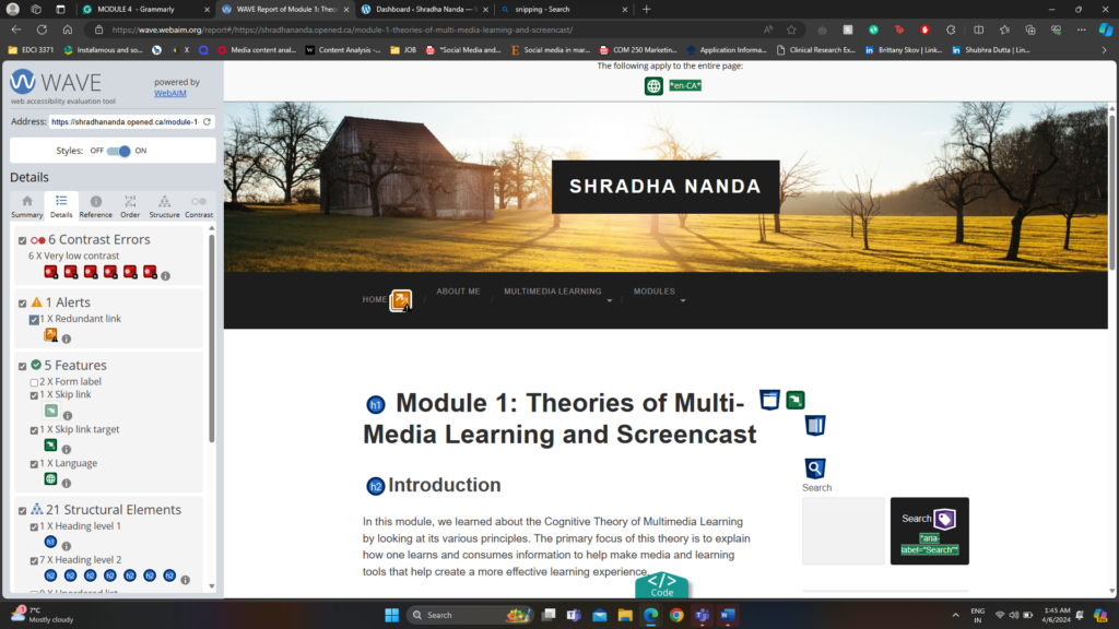
After analysis, my first module using WAVE Accessibility I have added my screenshot
The image above describes different metrics like Errors, Contrast Errors, Alerts, Features, Structural Elements and ARIA about the last blog post Module 1.
After reviewing the WAVE report, the most important warning that stood out to me was the contrast error. My WAVE Accessibility reports point out that there exists a very low contrast between text and background colours. Adequate contrast of text is necessary for all users, especially users with low vision. To fix this, in the next blog post, I will increase the contrast between the foreground (text) colour and the background colour.
CANVA
I have used CANVA in the past for both academics and work. I have made infographics, posters, Instagram posts and videos. I find Canva, a very essential tool in my life. I love working with it and find it very intuitive and easy to use.
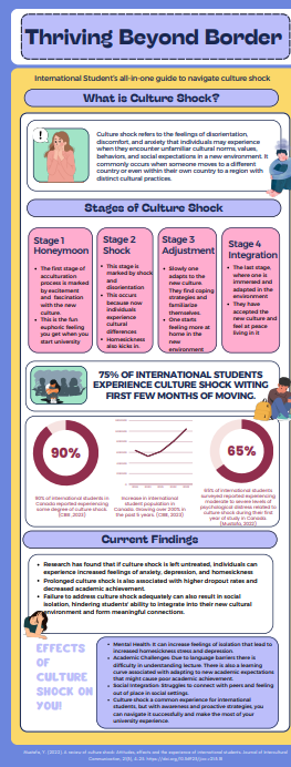
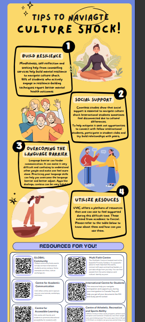
I recently created this infographic for a immigrant psychology class. This infographic introducing us to the topic of their infographic culture shock, and gives us a clear definition, followed by the stages of culture shock, some statistics, and current findings and effects of culture shock. The infographic then goes on to give some tips to navigate culture shock and leaves 6 different resources people can reach out to.
Reflections
Running the WAVE Accessibility Report:
Running the WAVE Accessibility Report on my blog post was very interesting. It gave me a lot of insights that I would never think otherwise and can really help improve the conent.
While I knew the WAVE program would help me identifying potential accessibility issues, I was surprised by the specific areas that needed improvement. For instance, I discovered instances of inadequate color contrast. Overall I would be using this software and running my content through these to make my content accessible.
Leave a Reply