In this module, we are introduced to multi-media learning by studying theories and understanding how we humans take in information.
These are important theories to keep in mind when designing a curriculum as it would make sure the material is engaging and is learned well instead of just presenting a bunch of information that students might forget.
The main theories that we went over were the Cognitive Load Theory, the Dual Coding Theory and the differentiation of intrinsic, extraneous, and germane cognitive loads. We also learned about Mayer’s principles to reduce unnecessary cognitive load and enhance understanding.
We also are introduced to practical tools such as Screencast that can be very helpful in making engaging videos. Some applications of Screencast could be teaching students how to use a particular software.
Reflections
Out of all of the principles that we learned about the one that is seemed the most intuitive to me was the Modality principal
The Modality Principle: This principle states that learning is more effective when information is presented both orally and visually rather than just one of the ways. The module also states that out of all of the other learning theories the modality theory has the strongest amount of evidence.
The reasoning for this is that humans process visual and auditory information separately but simultaneously, which increases the ability to understand and retain the information being taught.
I find this very intuitive as I am a visual learner and have been intuitively applying this in my life.
Surprising Principle: I found the Redundancy Principle to be the most surprising. The redundancy principle states that adding unnecessary or additional text to something that is already narrated, can create extraneous load.
Extraneous load impedes and by avoiding repeating information in your multimedia learning objects we can help students learn better.
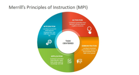
In this module we learned about design principals and learning strategies to help make a more engaging and dynamic learning experience by understanding planning and meticulous design. In specific, we learned about common instructional design and lesson planning principles and models. In this module we also learned about learning objectives, assessments and activities to ensure that learning is interactive and engagement . One of the most fascinating topic that I learned in this module was that of multimedia integration. This principal refers to the addition of different media activities like videos, interactive stimulations to increase student engagement. We also learned about Merrill’s Principles of Instructions. One important rule is that learning is problem-centric. It also states that new knowledge is added on old existing knowledge. Using these laws one can plan for more engaging learning experience.
Experience with video game learning supports?
To answer this question I will be using the example of the video game Genshiken. In the game we observe the Coherence Principle. This principal suggest that material and objects that are not important must not be embedded in the game. If added this could cause confusion and cognitive overload. The game focuses more on individual story and plotlines removing discretions and complicated interconnected plotlines. The game also applies multiple media formats like on-screen text and voice overs integrated the Modality Prince.
The game uses the Merrill’s principle by primary being problem-centric where players solve puzzles, win battles and find clues. It also builds on prior experience as people who play open-world fantasy games are better as the rules and puzzles are similar
Historia
Historia is a game-based learning system that we learned in this module. We could use the following principles to improve the gaming experience. By adding interactive storytelling , that adds multiple media elements such as background music and sounds effect could be used to enhance the games feel to the audience. We could also add branching storylines to make the storytelling more interactive that shape the outcome of historical events based on their choices.
Game Based Learnings
Using game-based learning could help provide a more engaging platform for students. Especially for children who are visual learning using game-based learning would help capture their interest and thereby bost their creativity and memory. Some examples of these could be using a 3D model to explore historical civilizations, wars and stories. We could also use interactive games to help visualize data to explain statistics and help students uneaten it better,
Balance between active and passive learning
Passive learning and active learning are both essential tools to impart knowledge. Personally using passive learning would help impart knowledge and make the user and audience familiar with knowledge. Active learning helps the audience to engage in the material better and apply the knowledge better integrating. However, the balance between both are ultimately depending on the individual as this balance depends mostly on individual learning styles, course objectives, and instructional method used.
H5P
Trying out H5P was a positive experience, as it offered a user-friendly interface and a variety of interactive content types to choose from. In my teaching context, I would likely make the most use of activities such as interactive videos, quizzes, and branching scenarios. These activities provide opportunities for students to engage with course material in dynamic ways, fostering active learning and enhancing comprehension. While some activities may require more resources to create, such as complex simulations or interactive presentations, HPP5 is still easy to navigate and can elevate the content you try to produce
In this module, we learned about generative AP and using it to make modules and curriculum
The Generative AI I chose to explore was DALL-E.
I have used Chat GPT and perplexity in the past for my work as a Social Worker. I use them to help edit and modify my curriculum plans to help youth with learning disabilities learn better but I have not yet used any generative AI that could help me create images from a prompt.
Therefore for this project, I experimented with DALL-E to help create images from text prompts that I provide.
Outcome
Prompts – For my first prompt I asked DALL-E to create a image of my favorite sports team winning a tournament. The prompt was “Create a hyper-realistic image of RCB winning the IPL trophy this year and AB de Villias also present to support his team”.
Experience
I loved using DALL-E as an AI. Using it as an AI helped me create images of prompts in great detail. I can see myself using it to add pictures to my lesson plans and curriculum to help make the content I produce more engaging by adding an interesting virtual element. As the prompts can be personalized I could make the images more relatable making my content more intriguing.
The images also are very much like real-life pictures which increases the credibility of the images generated.
Despite being so easy to use, I find that the first version of the result even if the prompts is not the best but after asking the AI to regenerate it gives the best result. I also found that despite being very creative, the image lacked a human touch. Some things just seemed off, few images felt fake as there were distortions. I wanted to then test, how different are images they are created by humans and those generated by AI.
Prompts 2
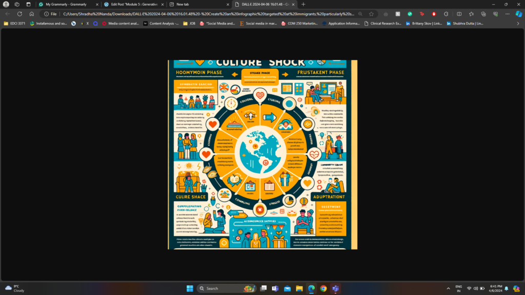
After playing with the software for some time, I decided to test if it could make informative infographics that provide relevant details and resources. I prompted it to make an infographic about the mental health care crisis that international students face and compare it to the one I created for the last module.
Here are the results
Prompts
Result
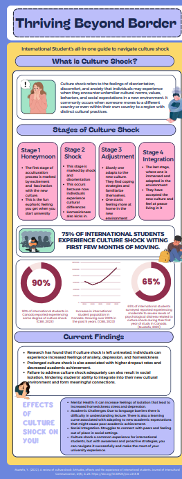
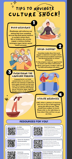
Infographics created by human
Analysis
Both the infographics goes into great dept to explain the concept of culture shock, different stages of the culture shock , strategies and resources that international students could use.
The infographic made by AI was more general and did not have any citations to support claims but infact had a more generalized ideas . The infographic made by human was more in-dept and had more resources
I find that the infographic made by the human is more aesthetic, has a better color scheme and is less of a typos. On the other hand, the AI-generated infographic fit all the information in one page making it cluttered. It also had alot of typos and mismatched colors. I feel that the one made by AI had to be fine-tuned by providing multiple promotes. It would have been easier to fix it on my own.
Sections Analysis- Applying the SECTIONS approach we find the following information
Students – As DALL-E is free, accessibility for old users, usage depends on factors such as Internet access, knowledge and familiarity .As it can be accessed via the internet and does not need to be downloaded, a stable internet connection is a must. For new users institutions could provide access code that could be used by students making it accessible.
Mitigation – Providing access to computers on campus or ensuring students have access to a computer and a stable internet connection would be a good strategy to begin with. Having a trail period where students could use
Ease of Use – DALL-E is a very easy-to-use and intuitive software. However, learning how to give prompts that can produce detail-oriented results has to be learned. This is easy to do and users can learn this intuitively without training by using it once or twice
Costs – DALL-E is a free software and comes with no extra costs for old users however if one is a new user one has to get ChatGPT plus for this. Chat GPT plus comes at a cost of 20$/month. Institutions can buy ChatGPT enterprise at a sloghtly lower rate and offer it to their students like one offers MS Office 365.
Teachings – DALL-E can be used to support teachers as it can be used to create images and visual aids that help make the content more engaging and promote learning. ps explain topic through visual indicators which we know helps enhance the content exponentially.
Interactions – As DALL-E is used in content generation it does not directly impact interaction but it has implications for that. For example, DALL-E can be used make posters, and infographics that can be used to initiate conversations
Organization – For the ongoing use of DALL-E , institutions could access funding such as those used to access other softwares like Surveymonkey, Office 365 etc.
Networking – We could not directly impact networking using DALL-E however it can be used to provide passive engagement materials like posters, paper Q and A forms, infographics and business cards that could help enhance communication
Security – Making sure that the information generated and the data input are private and in compliance with privacy regulations is very important. DALL-E is a security website but schools and institutions need to make sure they are in compliance for privacy protocols . Institutions should also have procedure and protocols ready in response to a security or data breach.
Reflection
Where do you think these tools will be in their evolution in 2-3 years’ time?
Over the next 2-3 years, I believe that AI tools would undergo a significant advancement. The more they are used right now the more data they will have to improve their algorithm and provide better outcomes results.
Enhanced Performance and Accuracy: With more data that is being processed rightnow AI is being trained to produce higher quality outputs with greater accuracy. Improved algorithms and training techniques would make AIs work much more efficient and humanized.
Expanded Applications and Domains: AI tools are slowly growing and finding use across diverse industries and domains, including education, healthcare, finance, manufacturing, and entertainment. For example first AI, was used to write code and information but now is used to create images, videos and even music. I believe that AI technology will also becomes more accessible, enabling innovative solutions to complex problems.
Shift in Job Roles: People fear that AI will take over their jobs this is evidenced as AI has taken over jobs like copywriting. While some jobs may be replaced by AI-driven automation, new job roles and opportunities are likely to emerge as a result of AI adoption. These new roles may involve tasks that require human creativity.
In this module, we learned about the ability of design that can be used to improve learning. We went over the Universal Design for Learning (UDL) principles. Using UDL helps increase engagement as it is made to engage students in more than one way, represent content and promote student engagement.
We also learned about graphic design principles to make sure the information presented is easy to read, coherent to prevent cognitive overload to make sure information is understood
We also learned about WAVE Accessibility checker, text-to-speech tools and Canva as practical tools that help enhance the accessibility of the material.
WAVE Accessibility Report
WAVE Accessibility Report helps analyze content and websites to show how accessibility can be improved.
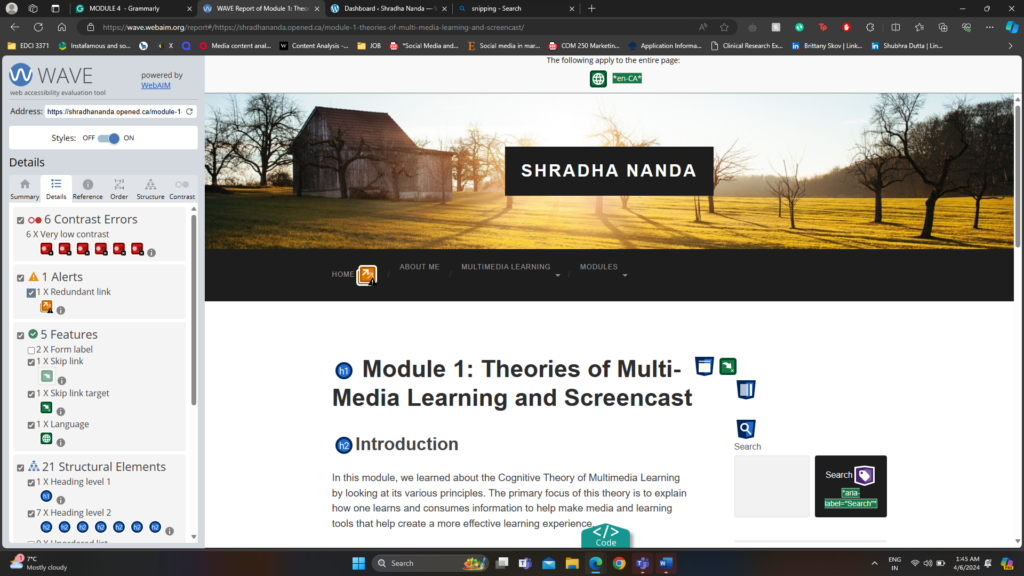
After analysis, my first module using WAVE Accessibility I have added my screenshot
The image above describes different metrics like Errors, Contrast Errors, Alerts, Features, Structural Elements and ARIA about the last blog post Module 1.
After reviewing the WAVE report, the most important warning that stood out to me was the contrast error. My WAVE Accessibility reports point out that there exists a very low contrast between text and background colours. Adequate contrast of text is necessary for all users, especially users with low vision. To fix this, in the next blog post, I will increase the contrast between the foreground (text) colour and the background colour.
CANVA
I have used CANVA in the past for both academics and work. I have made infographics, posters, Instagram posts and videos. I find Canva, a very essential tool in my life. I love working with it and find it very intuitive and easy to use.
I recently created this infographic for a immigrant psychology class. This infographic introducing us to the topic of their infographic culture shock, and gives us a clear definition, followed by the stages of culture shock, some statistics, and current findings and effects of culture shock. The infographic then goes on to give some tips to navigate culture shock and leaves 6 different resources people can reach out to.
Reflections
Running the WAVE Accessibility Report:
Running the WAVE Accessibility Report on my blog post was very interesting. It gave me a lot of insights that I would never think otherwise and can really help improve the conent.
While I knew the WAVE program would help me identifying potential accessibility issues, I was surprised by the specific areas that needed improvement. For instance, I discovered instances of inadequate color contrast. Overall I would be using this software and running my content through these to make my content accessible.